


New England Economic Adventure Website
Responsible for...UX | UI | Information Architecture | Wireframing | Prototyping | Usability Testing | Sitemaps | Mockups
This site was created to promote The New England Economic Adventure which was a mix of interactive exhibits and activities that existed at the Boston Fed.
I am not responsible for the colors and visual design of this website. An outside agency branded the exhibit space and I was required to make the website match their unfortunate mid-1980s design aesthetic. I matched it pretty well and the UX is solid (that's why I've included it here), but the visual design choices were not mine.
Keep scrolling for a description of the UX Design process, a sitemap, wireframes, a prototypes and mockups.
The process...
Until 2013, the Federal Reserve Bank of Boston had an Economic Education Department devoted to educating the public about the economy. They operated an exhibit and learning space within the building called The New England Economic Adventure which hundreds of students visited every year. The space had a permanent section featuring famous New England entrepreneurs and innovators, a learning/lecture/presentation area and a section that featured new exhibits twice per year.
The Economic Education Department wanted a website to advertise the New England Economic Adventure to schools. They also wanted to use the website to show past exhibits because there had been so much material created for them that it seemed like a waste for the educational opportunities to be lost when the exhibit closed.
Requirements
- Website should match the new "brand"...
It wasn't exactly a brand. I wasn't given a style guide but an outside design agency was simultaneously redesigning the exhibit space and the website needed to match it. - Target users were middle-school teachers.
- Promote the Economic Adventure as an evolving educational resource...
The first thing we wanted to do was capture everything that the Economic Adventure used to be because it was going through some major changes. I was designing the site and adding content to it while they were creating new features that we weren't allowed to highlight yet. So the goal was to launch the site when the space redesign was unveiled in February 2011. Then, over the next year, I would add content and pages until the website itself wasn't only an advertisement for the exhibit space, but an educational resource all its own.
The physical space was set to be unveiled in February 2011 so the website needed to be finished and ready to go by the last week of January.
I think competitive analysis is valuable but this website was pretty straightforward. We just needed to present a lot of information in a way that was easy to navigate and would allow teachers to preview exhibits and plan field trips.
Our target users were middle-school teachers. We had two personas with a few scenarios.
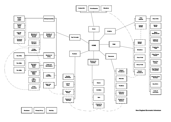
Content Audits and Information Architecture
There was a lot of content that needed to be organized into categories and pages. The content authors in the Economic Education Department took a first crack at getting it all into some loose categories and concepts. I refined it a bit myself and then card sorted with interns and other team members who weren't involved in previous content development discussions and weren't acquainted with the subject matter.
Mouse over to enlarge
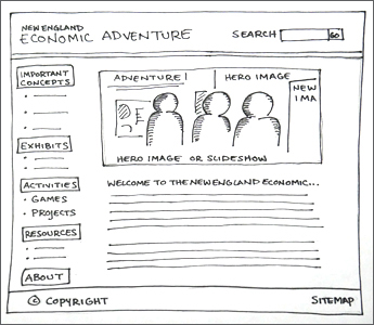
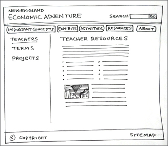
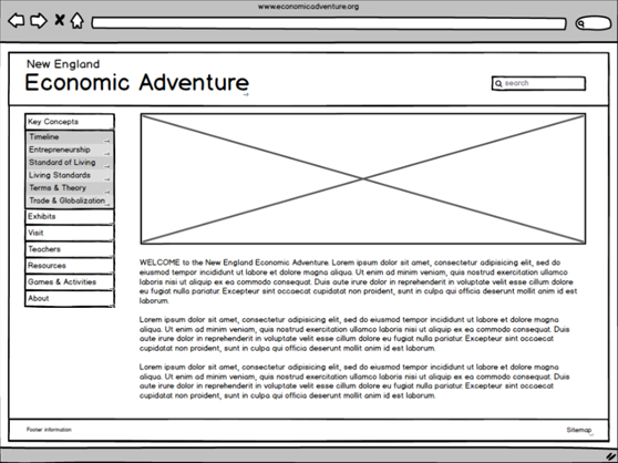
Wireframes
I sketched out the wireframes then fleshed them out in Photoshop.
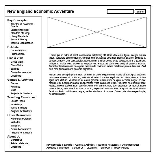
Prototype
Prototypes were created in Blasamiq.
Click to try out the prototype.
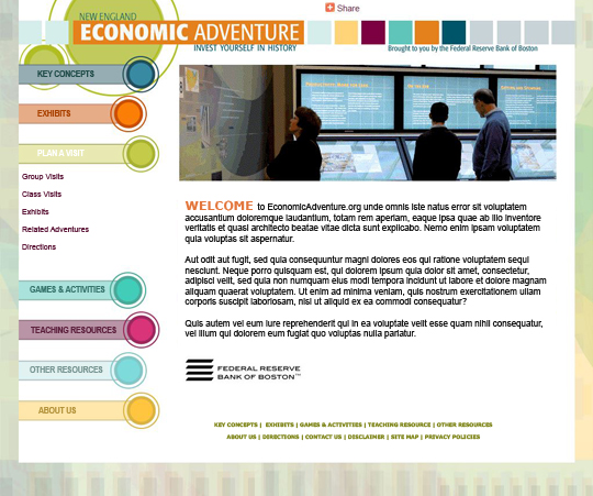
Mockups
I used Photoshop for mockups. The visual design of the site needed to look like it belonged with the physical Economic Adventure space which was designed by an outside design agency. We might typically call that "branding" but in this case it was more like imitating because the agency only provided a few printouts of patterns and colors. I did my best to incorporate them into the site.
I built the website and tested it with team members and interns. We also sent links to some teachers asking for their feedback. I refined it all based on results from the usability tests and teacher feedback and then I tested it again.