

Jordan's Furniture Product Detail Page
Responsible for...UX | UI | Heuristic Review | Competitive Analysis | Wireframing | Prototyping | Information Architecture
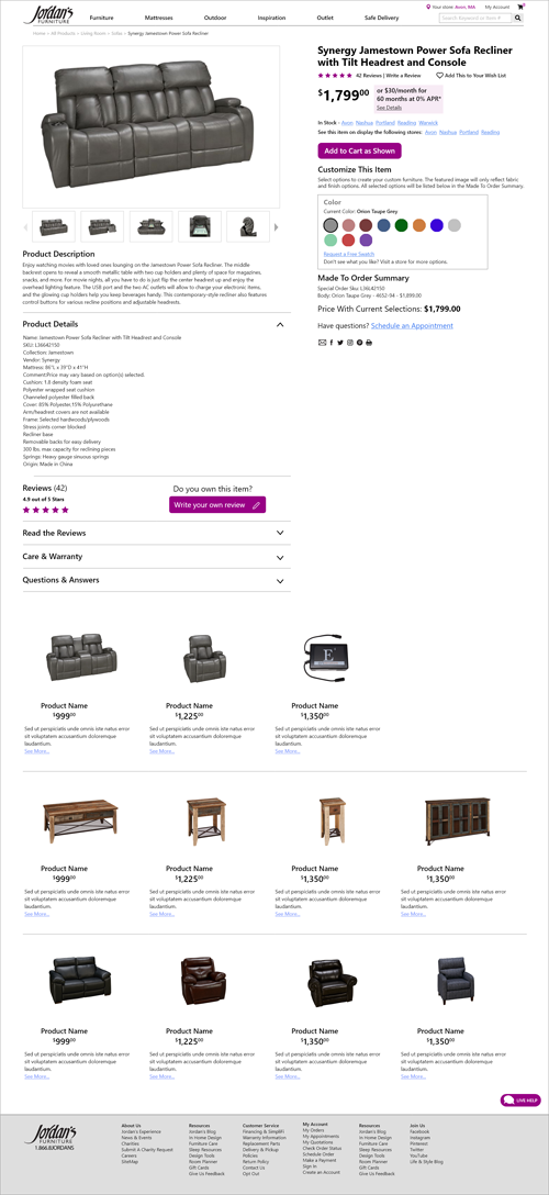
Jordan's Furniture asked me to redesign their product detail pages. I should note that my changes have not been implemented into the current site yet. The interface of their current design looks very dated. It's cluttered with big, bland buttons that all look the same so they're easy to overlook. Lines of text with small font sizes are stacked on top of each other making it easy to miss important information and links. When encountering poorly designed UX and UI, potential customers are forced to wonder whether their credit card and other personal information will be secure. Jordan's risks losing customers to one of the many other competing furniture stores with more carefully designed websites. Keep scrolling for a description of the UX process.
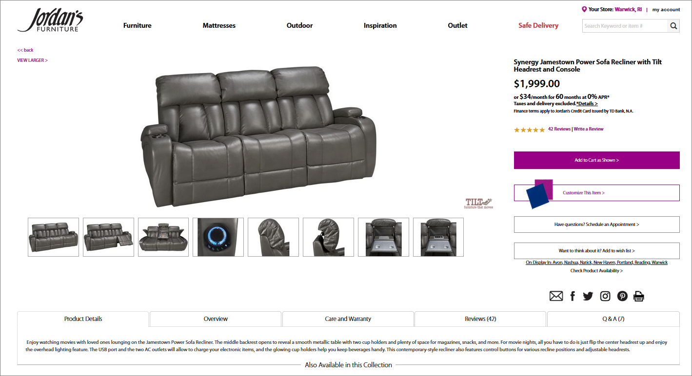
BEFORE...
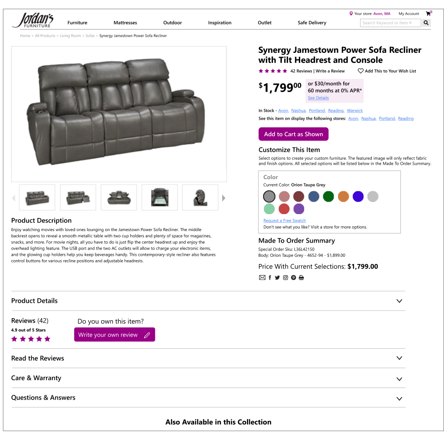
AFTER...
HERE'S WHAT I DID...
Met with Stakeholders and Gathered Requirements
The requirements were simple: "Make a better product detail page."
Performed Competitive Analysis and Heuristic Reviews
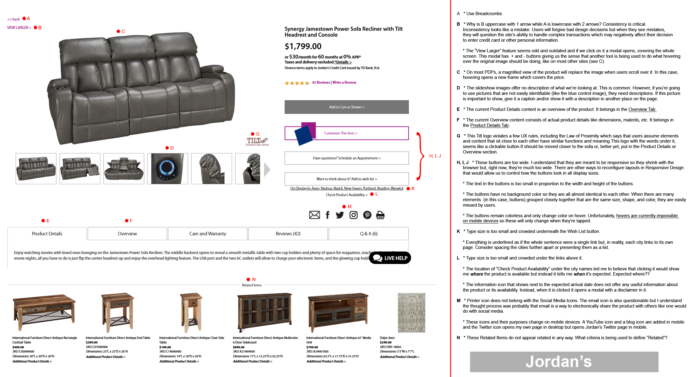
The first thing I did was conduct a heuristic review. I went through the page and pointed out the things in the current design that should be changed to meet UX standards. Next, I did a competitive analysis to see how their design stacked up against those of other furniture stores. I also did heuristic reviews of the competitor pages to show what we can do better or aspire to.
Click the image to see the Heuristic review and Competitive Analysis...
Designed Wireframes and Mockups (These are just a few)