

Dailybreak User Experience Site Review
Consulting: UX, Information Architecture | SitemapsDailybreak.com asked me to review their website, recommend changes and present to their group in Boston.
These were my Information Architecture recommendations. They didn't follow a single recommendation.
The biggest problem, as you'll see below, was the Support section. When I took on the challenge, Support was an overstuffed junk drawer of a category. Most of the things in there, like Newsletters, had very little to do with Support.
Three or four years later and nothing has changed except for the addition of some pretty colors. Someone hid the support link at the bottom of the page but it still contains the same irrelevant content.
The process...
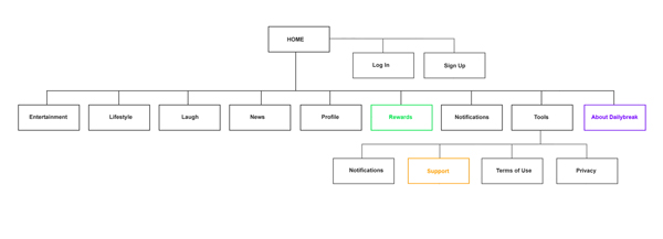
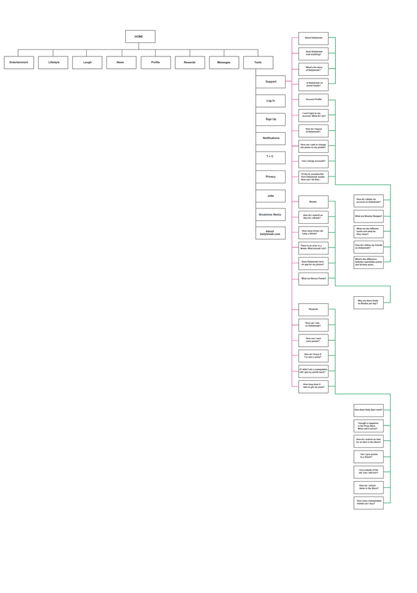
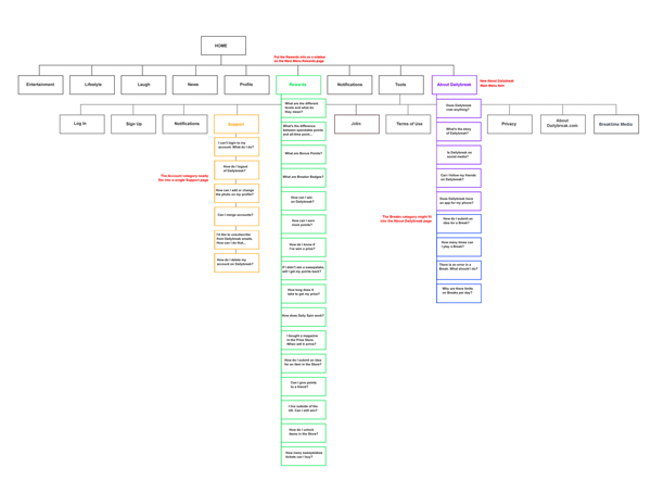
Here we have the current information architecture. Support, which is located under Tools, has four categories.
The current architecture (Mouse over to enlarge)
Each category has five links (or less) going to their respective pages. This works fine for the About Dailybreak category because it only has three links. The others, which have more than five links each, require us to click the View All button which brings us to a topic page where all the links for that topic reside.
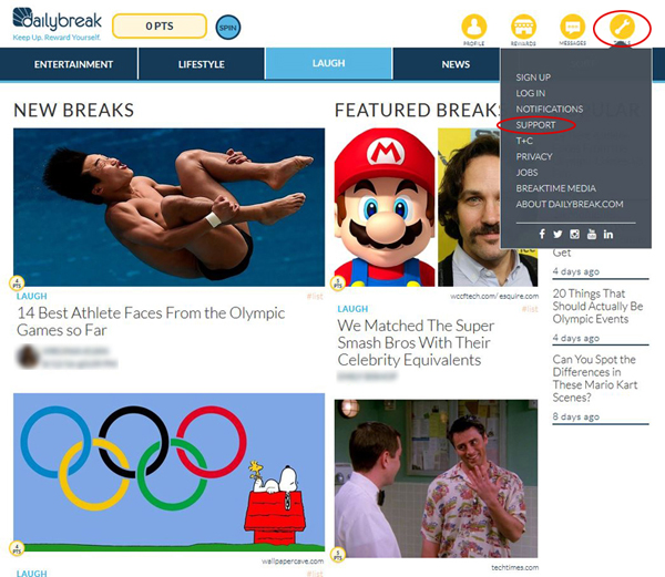
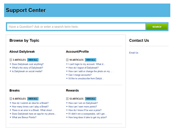
We can see some topics on the Support page but to see more, we have to go to another page, which also contains the same links we saw on the previous page.
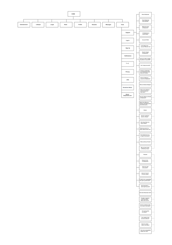
What we are left with is a tangled web of topic pages that needs some organization.
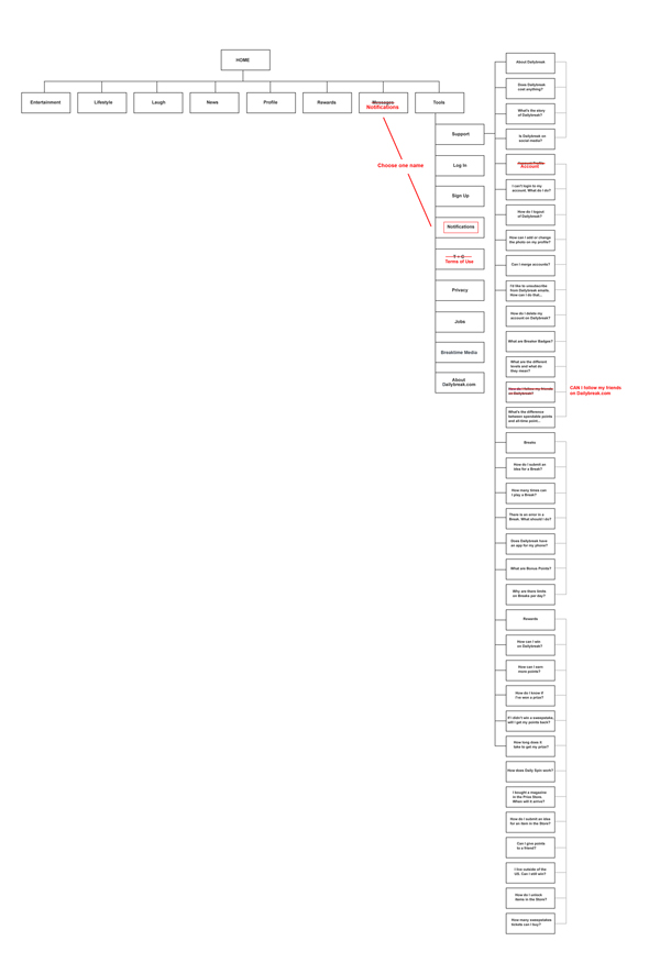
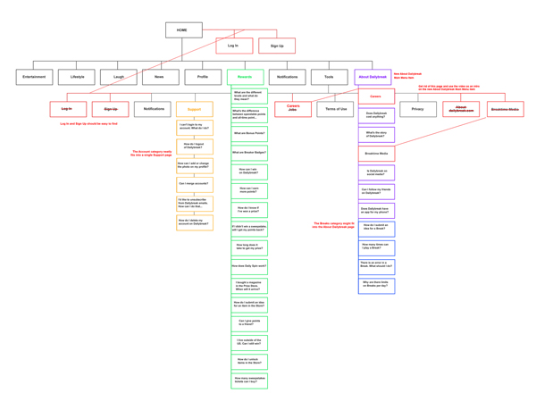
Let's start by changing a few labels...
- Notifications and Messages go to the same place so let's name them both Notifications.
- T + C is not an intuitive label. Let's name it Terms of Use, since that's what it is.
- I would change Account/Profile to Account. We already have a profile category in the main navigation.
- I would change "How do I follow my friends on Dailybreak" to "Can I follow my friends on Dailybreak?" and explain "how" on the page.
With those few name changes made, we can now look at organizing categories and content. If we were in a meeting about information architecture or doing a card sorting exercise with potential users, we would go through it subject-by-subject and see where the various pages and topics make the most sense.
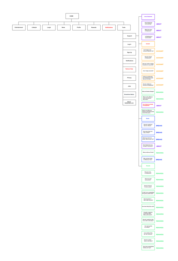
Let's group them together to see what we're working with.
In a few cases, some topics might make more sense under different headings...
- I think the Account category neatly fits into a single support page.
- Rewards questions belong with the Rewards category up in the main nav.
- The Breaks questions seem to fit nicely under About Dailybreak, which, instead of being hidden away under Support, deserves its own top level spot with Rewards, and Profile and Tools in the main nav.
Since the only thing on the original About Dailybreak page was an "About Us" video, we should remove the original page and bring that video to the About Dailybreak page.
Jobs (which I would rename "Careers") and Breaktime Media both fit neatly into the new About Dailybreak page too.
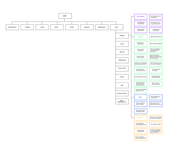
Sign Up and Log In should be easier to find.
Right now, this is a pretty clean set-up. We could stop here and call it a success but I think we could take it one step further. What if we took all these topics and consolidated them into single topic pages?
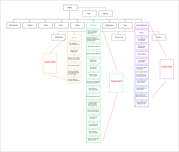
Cleaner, more efficient navigation. Nothing is hidden and everything seems like it has a reason for being where it is.